Monthly Archives: December 2015

Initial thoughts on “The man-made environment” theme

December 2015

I have decided on architecture as the theme for Assignment 2, stage 1 (topic the “man-made environment”). In particular, I wanted to focus on the work of Brazilian architect Oscar Niemeyer. His bold and flamboyant designs are in the movement of “International Style” (1) and combine neat rectilinear forms with lack of ornamentation. His  buildings often use bold colours. His style extends to open, light-filled interiors which are also a fascinating source of inspiration. Norwich University of the Arts library have many books on his work from which I have selected a ‘scrapbook’ of inspirational images. The only concern I have regarding Niemeyer’s buildings is that I will have to work entirely from photographs because I am unable to visit and sketch his architecture. I considered How I could extend my theme.

When searching for Christmas gifts on the National Trust website, I came across a book with a very engaging front cover. The book was “Brutal Utopias – A National trust guidebook” (2). The image provoked a strong and immediate response. Nasturtiums we’re growing in a way reminiscent of that in which wild flowers would grow on a natural cliff; clinging with little light or soil, peeping out from a hard, cold, grey edge. 

In the world of “Brutalist” architecture, the human is removed from the natural environment. The Park Hill development in Sheffield is a series of concrete “cliffs” winding high on the top of a hill. The idea was that residents would walk along “streets in the sky”. In doing so, however, they are isolated from their natural environment – from trees, grass, the scent of Autumn leaves…. It reminded me also of another Brutalist building which I visited – The University of East Anglia. I remember on an undergraduate open day walking along cold windswept concrete walkways – like the path of a river artificially channelled, my path was pre-defined. I could not leave the path and run across the grass, I could only move backwards or forwards. It was perhaps this inhospitable environment which contributed to my decision not to study at UEA. The conflict between human and concrete is a concept which I still find fascinating, and UEA provides a series of brutalist buildings which are geographically close enough for me to visit and sketch. 

So I have decided that my theme will be “the International Style of Oscar Niemeyer” and “Brutalism”. I am in the process of sketching my ideas and developing designs based on the images I have gathered. I am finding it much easier to draw visual responses to this topic than “cultural fusions” because I can better relate and attach meaning to these images.


References:

1. Dempsey, A. (2010) Styles, schools and movements. The essential encyclopaedic guide to modern art. New and expanded edition. Thames and Hudson. London

2. Watson, T. (2015) Brutal Utopias. The National Trust. Swindon.

Gainsborugh’s House Print workshop exhibition

November – December 2015

Gainsborough’s House print workshop (where I have just completed a printmaking course) hold an annual exhibition and sale in Bury St Edmunds. Exhibiting is open to all members of the workshop, so some by professional artists, some by tutors and some by students. I was interested to see the range of work, so went along. There were a couple of artists who particularly caught me eye.

The first was Emma Buckmaster. Emma studied Printmaking at Cambridge School of Art and was until recently, joint chair of Gainsborough’s House Printmakers.

I particularly like Emma’s etching Spider I. I have no idea how she created the image. The spider is so delicate that it almost looks as if it has been caught between two pages of a book. The detail of hairs on the legs is amazing. The composition, with the foliage to the right creates the feeling of a ‘frame’ from which the spider is suspended. I like the the background marks behind the spider, and also how a dark shadow hangs over the top left. This helps to frame the spider in the centre, and also creates a sense of mystery by causing the viewer to question what is casting the shadow.

Second, I really liked Kit Leese‘s etching of Blakeney Creek. Kit has been a professional artist for over 40 years and looking at his website I can see that he has made many more beautiful tonal etchings of the East Anglian countryside. His style, and the subject of tidal estuaries are particularly suited to etching. His prints really capture the beauty of the scenery with subtleties of tone used to describe different quality of material (e.g. mud, grassland, wooden stakes), and variable reflections of light hitting these surfaces.

Printmaking workshop weeks 6-9

November 2015 

Gainsborough’s House printmaking workshop weeks 6-9

The final four weeks of the printmaking course at Gainsborugh’s House studio were the reason that I had initially enrolled on the course – for some practical instruction on screen-printing.

Compared with the first five weeks, I was disappointed. We only received tuition in week 6, after that it was down to us to experiment. The difficulty was that we only had one screen allocated to each of us, so every session it was only possible to print one set of runs (there was insufficient time for the screen to be cleaned and dried). Consequently, most students went back to other forms of printing like intaglio or Linocut. I persisted with the screen printing, but I didn’t feel that I’d gained as much from the course as I’d hoped.

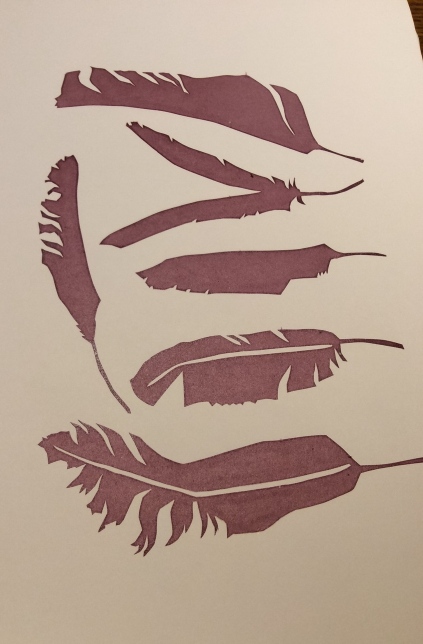
I started my making a simple paper stencil and trying a basic print. I used the “fallen feathers” theme from Assignment 1, Exploring ideas.

At first I couldn’t get a clean crisp line (see below). It turned out that I was not putting enough pressure on the squeegee. 

Eventually I made a better (although not perfect) print (below)

I experimented by using torn paper stencils to make a second layer (see below)

I Intended to try and create some of the effects of multiple printing in Jane Dunnewold’s book Artcloth (1), and the screen printing publication by Committed to Cloth (2). I think this layering would have been better had I printed the feather design second (on top).

I also tried experimenting with two colours of paint (below) to make an intentionally streaky effect. I don’t really like the outcome, I think because the colours are too similar and it looks muddy.

An image of the torn paper stencil printed on it’s own is shown below.

I love the effect of the torn paper, although the stencils did start to degrade and pull off after approximately 4-5 prints.

I also tried printing over some fabric mesh (net) placed between the screen and the paper. Unfortunately this was not successful, probably because the net was too thick. It also did not adhere properly to the screen so fell off creating a horrible mess and preventing any further printing. In future I could try a small amount of glue. 

I also think that rather than printing 3 screen printed images on top of each other it would have been more effective to mix methods (e.g. Dyeing, screen printing, block printing)


References:

1. Dunnewold’s, J. (2010). Art Cloth: A guide to surface design for fabric. Interweave Press. Loveland

2. Benn, C. And Morgan, L. (2009) Screen printing: Layering textiles with colour, texture and imagery. Committed to cloth. Surrey.


“The Bank” Eye, winter exhibition

26 November 2015

The Bank” is a community arts centre and coffee shop in the small Suffolk village of Eye. I went to view their winter exhibition with a couple of other OCA students.

The exhibitors were by local artists, and work covered all subjects and media. The quility of wor was variable, but there were a couple of artists which particularly interested me. Unfortunately, neither have a presence on the web, so I am unable to properly reference their work. I did however make some sketches and notes during my visit.

The first artwork of interest was a large rectangular canvas by Sami Malik. He/she has used blue and green palette to define an ovoid shape (see below)

On closer inspection the image seemed to represent an adult body curled into the foetal position. There was not much detail in the painting, but the way the blues and green were used to define shadows and outlines was interesting. The feeling was cool, calm and restful. Sami had used some sort of textural effects on the canvass too. It was difficult to see how this was achieved because the painting was placed so high up on the wall. It could have been textured tissue paper.

The second exhibitor who interested me was Malka Scholton. His/her artwork were large pastel landscapes of scenes along the Suffolk coast. What was interesting was that stunning effects were achieved with very economical use of mark and colour.

The example above shows a very strong composition. To the left, the image of the cliff almost fills the paper, dominating and leaving little sky. The perspective is dramatic with the cliff and beach receding quickly into the background. As a viewer you feel as if you are standing right under the cliff. 

The mark-making was almost akin to a quick sketch done on the beach. The few marks were bold and purposeful. In the foreground to the right was a huge area of rock in shadow, which had little detail. This helped to balance the large area of cliff-face to the left and drew the eye along the cliff to the church in the horizon on the right.

The background paper was black. I would not have thought of using this base colour, but it was extremely effective. It made the pale grey/blue sky stand out. The grain of the paper also helped to give textural qualities to the clouds, cliff and beach. Most of the pastel drawing was brown, black and grey/blue. Tiny areas of accent colour (lemon and pink) were used to give a hint of light touching certain areas, and this gave the drawing a tremendous lift of interest. 


Assignment 1 – Reflective commentary

December 2015

Textiles 1: Exploring ideas, Assignment 1 – Cultural fusions

Reflective commentary


I chose native North American culture for my topic because of it’s strong symbolism a close relationship to nature. Unlike previous modules, I have not felt phased by the amount of design work/volume of samples. Computer software helped, and I took the risk of spending time to try out different programmes and learn how to use them to manipulate images and create patterns. At last, I am beginning to feel comfortable with the design process and consequently, feel that I have produced some strong outcomes for this assignment. 


The colours and textures in my Snoshone Lake samples work particularly well. The main colour palette is complementary (blue and orange), contributing to a real lift and energy in these pieces. The range of yarns and fabrics, and how they have been juxta-positioned gives a lively contrast of texture. The balance of colour is also important, so as the bright orange does not dominate and overshadow the cooler blues and greens.


A change of direction came with an appreciation of cultural sensitivities. It meant that I concentrated on more abstract ideas which were not identifiable as facsimiles of historical designs. It probably pushed me to be more creative. An example is the “blackfoot dress” inspired fabric block print – a simple analogy which was adapted into an effective sample. By introducing green (complementary), and accents of heavier lines, the piece was given a 3-D feel and became much more interesting.


At stage 4, I had to review my designs and samples in the context of colour trends in fashion and/or interiors. I would have preferred to do this earlier in the process, so as to better influence my division of time (particularly I would have liked to spend more time on tassels and fringes). It is a good learning point for future assignments.


Homeware colour trends are almost exclusively neutrals, blacks and whites. I altered some of my samples as a result of this research (e.g. the “feather mirror” prints). These pieces work well because of variations in tone and distinctive geometric shapes.  The two “Sioux breastplate print/appliqué” samples work less well because of confusion/conflict between the printed areas and the triangular shard shapes.


I have thought about my creative voice, and feel it is being reflected in the presentation of crisp, distinctive shapes and outlines, contrasted with “messy”, textured areas. This is self evident in the “fallen feather” prints (stencilled areas, vs. block-printed areas). Snoshone Lake weavings also demonstrate a similar contrast between “messy” texture (landscape and grassland) compared with bold untextured shapes (more regularly woven blue sections).


Outside OCA, I exhibited with textile group ‘Chain Reaction’ at Snape Maltings in September. I joined a new group (‘The Print and Stitch Group’) recently, and I am delighted that my idea of ‘Identity’ has been chosen as an exhibition theme. I have also just completed a course at Gainsborough House Printmaking workshop on drypoint etching, plate etching, linocut and screen printing.


Interpreting cultural sources, Stage 4 – Selecting designs for a specified outcome

December 2015

Having collected source material (stage 1), developed lots of design ideas (stage 2) and worked them into samples (stage 3), stage 4 asks for one design idea to be chosen to be developed towards a product, and one which could be developed as a more conceptual or expressive piece.

I had already conducted a review of colour and fashion trends in clothing and homeware. I have discussed this in my blog entry for stage 3, because it influenced development of my samples. I will now choose one sample from each of the categories (product and conceptual) and discuss their merits and ideas for further development.


1. Design idea to be developed towards a product

My strongest design ideas for development towards a product are my fabric samples. I am torn between my two “feather mirror prints” (samples 5a and 5b), which I envisage suitable for covering furnishings or cushions, and my “Blackfoot dress inspired print” (sample 6), which I see as suitable for a dress fabric.

Feathers_sample2.jpgfeathers_sample1.jpg

I think that the mirror feather prints (above) fit slightly less well with the trends because although geometric, they are quite “fussy”, (i.e. detailed) prints. Bold triangles or zig-zags would probably have been a slightly better fit. Having said that, quite intricate patterning is also popular, particularly on accent pieces of furniture (such as a single armchair in the corner of a room).

dress_print.jpg

I feel that my “Blackfoot dress inspired print” (above) is a very strong design and an extremely close fit with fashion trend predications for winter 16/17. Although the complementary colours of red and green work well, I could take the development further by exploring additional colour ways – maybe yellow and black, which also seems popular. I also think there is scope for a “family” of related prints and plain fabrics which could be used together in a garment collection.

The fabric sampling website I chose was cheap and quick, but did not give me the range of fabrics that I needed to explore this pattern properly. I always envisaged this design being printed on either pure silk (and made into a flowing blouse), or stretch jersey (to be made into a fitted top or dress). Either of these would work well. The next stage in development would be for me to think about garment designs, and to get some silk and stretch jersey fabric samples made, to properly assess these options.


2. Design idea to be developed towards a conceptual or expressive piece

My four samples developed using the Snoshone lake theme are already showing potential for development into an expressive piece, such as a wall hanging. They are powerful because of their contrast in textures and the use of complementary colours (blue and orange). Even as small samples, they are already bold and striking.

In my design work, I developed lots of collages because I wanted to explore how the image was changed by dividing it into sections, repeating areas, and rearranging parts of the picture. I wanted to see whether it would still make sense and whether these manipulations would enhance or take away from the power of the image.

The manipulation which really works for me is the one which is reminiscent of half-drawn blinds (p. 30 of design development book 2 – see image below)

The image retains maximum power by remaining whole and recognisable as a scene/view. The varying width of vertical stripes are like looking at the scene through half-drawn blinds. They also give a feeling of perspective, because as a viewer, you feel that you are closer to the thicker black strip than the thinner one. It therefore appears that the image recedes from right to left, into the background.

I preferred my woven analogy of the horizon, and my stitched analogy of the grassland (see photos below)


I see no reason why these two approaches should not be combined (maybe by stitching onto a section of weaving) to create the full scene. If the woven/stitched piece was made bigger (say 65cm width x 80cm length) the grasses would appear finer and more detailed, and provide an even better contrast with the “lumpy” texture of the green foliage and horizon. 

Black strips could be hung in front of the weaving/stitching to give the impression of looking through a blind, as demonstrated in the collage image above.


Interpreting cultural sources, Stage 3 – Creating a portfolio

18 November 2015

Stage 3 of Assignment 1 involves creating a portfolio and includes further drawings, development and creating of samples. 
 
Stage 4 is about selecting designs for a specified outcome, one of which is a design idea to be developed towards a product. I decided to conduct an investigation of colour and trends in fashion and homeware alongside working my samples (it was also convenient for me to visit the University library at this time). I have therefore covered the investigative work for Stage 4 in this post.
 
At this time I also discovered cultural sensitivity in using certain designs, and in the way in which they are used. This influenced the direction of my development and which designs I chose to take forward.  
 
 
Cultural sensitivities:

There are several well documented  cases of native Americans  being offended by fashion houses using their designs and symbology. This extends not just to the whole scale copying of a design (for example the copying of an Inuit shaman’s tunic), but also to the use of simple geometric shapes, such as KTZ’s use of Crow symbology in their 2015 dress design. Offence can also be caused by combining symbology belonging to different tribes and cultures, which is seen as diluting the cultural identity, and being disrespectful. The Navajo Yei bi chai is considered particularly sacred.
 
Having read these articles, I decided that I did not want to further pursue the following themes:
 
1. Geometric shapes inspired by Arapaho dress
2. Navajo Yei bi chai
3. Designs inspired by bead patterns
 
I consider that my other themes are sufficiently abstract to be devoid of symbology and the risk of offence. This doesn’t mean that I would never develop these ideas, simply that I would first seek involvement and acceptance from the native people with which they are associated. 
 

Trends in fashion:

I looked at both current clothing, and accessory fashion in magazines, and also I looked at a specific trend forecasting magazine. As suggested, I presented this research on a storyboard.
 
Three main areas I identified were:
 
1. The use of natural materials (faux or real), particularly suede and fur.
2. The trend for bold primary blocks, concentration on the waist and yokes. Contrast colours and fabrics.
3. Prints: contradicted shapes, intersections, chaotic lines and disjointed graphics.
4. Tassels and shaggy fringes (on everything from coats, dresses, jackets, bags). Particularly incorporating a shaggy dishevelled look.
 
My storyboard shows how these fashion trends have influenced some of my samples, and also the role played by cultural sensitivity in selection of designs.
 
The above photo shows the whole A1 storyboard. The two photos below show detail.


Trends in homeware:

I looked at both current homeware magazines, and also at a specific trend forecasting magazine.

The main areas I identified were:
 
1. A dominant colour palette of neutrals (beige, brown grey, black, white) with only the tiniest amount of accent colours (if any)
2. Plain glass lamp-fittings of LEDs (therefore fabric for lampshades was not considered)
3. Patterned fabrics to cover chairs/cushions working as accent pieces.
4. The use of bold geometric designs, particularly on rugs, throws and cushions. 

My storyboard shows how these homeware trends have influenced my samples, and the role played by cultural sensitivity in selection of designs.

 
The above photo shows the whole A1 storyboard. The two photos below show detail.


Further development and sampling:

Feather mirror theme

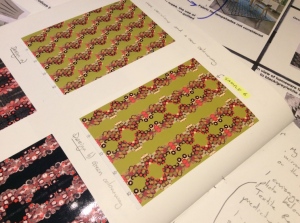
In view of my knowledge of the colour trends in homeware, I took my feather designs and re-worked them in greyscale. I produced two fabric samples which could be used for upholstery.


Feather prints
 
I then made a pre-sample using a design I had developed from an enlargement of my feather prints. I used hand-dyed scrim and hand-spun textured yarn. 
 
I simply ran out of time to work this into a full sample, but I think this design has lots of potential.
 
Sioux breastplate theme

I chose my favourite design from the photo manipulations of the paper breastplate model and sent it off to be made into a fabric sample. In view of the fashion of suede and neutrals, I chose the design with the chamois leather background. 


I developed my fabric manipulation into a second sample. In view of the homeware colour trends I chose beige. I considered how this sample could be used on it’s own for a cushion cover or combined as part of a geometric pattern incorporating black squares.
 
Finally, I took the Sioux breastplate negative space analogy/block prints, and cut them into disrupted shapes and sewed them onto a new background.
 
 
Although the finished samples have plenty of movement and energy, I feel that the finished result is somewhat too busy/noisy (see photos below).
 

Feather and Sioux breastplate themes combined

I created two related hand-printed samples using foam print blocks and feather-shaped stencils. These are direct fabric analogies of my prints onto paper. I called this design “fallen feathers”. I thought that it would work well as a lampshade fabric, but having reviewed homeware trends, the fashion is very much for simple LED lighting or glass lampshade.


Blackfoot dress theme

I love the simplicity of this image and the many possibilities for digital manipulation. I tried out different colour variations and different ways of tiling the image. The range I explored is shown in my Design development book 1. I settled on a green and red colour way (complementary). The design is consistent with the fashion trend for disjoint and disrupted geometric pattern prints.


Geometric designs inspired by Arapaho dress

Not developed further due to cultural sensitivities.

Navajo Yei bi chai

Not developed further due to cultural sensitivities.
 
Ribbon appliqué

Not developed further due to deviation of native American theme.

Designs inspired by bead patterns

I did not do any further development due to cultural sensitivities. However I did get a fabric sample made from one of the design that I particularly liked (see bleow).
 
I was slightly disappointed that the colours on the fabric sample were not as vibrant as the digital image.
 
Snoshone Lake theme

This is the theme that I envisage being developed towards an artistic piece. I worked two sets of samples.
 
I first worked the stitched samples. I used by colour card and collaged analogies to inform the proportions of the sections which I chose to work and the threads and fabrics used. 
 
Below: “horizon” stitched sample
 
Below: “grassland” stitched sample
 
 
I think both of the samples work, although I feel the grassland one is better. 
 
I then worked two similar woven samples:
 
Below: “horizon” woven sample (work in progress)
Below: “grassland” woven sample


I really like both these samples. There is a lot more texture and movement in the woven “horizon” sample than it’s stitched counterpart. The woven “grassland” sample is stiffer and more regimented than it’s stitched equivalent due to the constraints of warp and weft being perpendicular.

Tassels and fringes

Not developed further due to lack of time. In hindsight this would have been an excellent theme to develop. Maybe I should have looked at trends earlier in the assignment.

Experiments with natural dyeing

September – November 2015

In September I started to collect natural materials (bark, leaves, twigs, berries) and experiment with dyeing commercially spun yarn and merino fleece, and some fabric.

I had been on a couple of courses in the summer and wanted to consolidate my learning and extend my knowledge through practical work. Being autumn, there were time constrains (collecting dye-plants is seasonal).

Over the last three months I have does a lot of dyeing, resulting in a “library” of commercially dyed yarn for reference (see below)


I have also dyed fleece and then spun it into both plain yarn and fancy textured yarns. Below are some examples:


Above: cherry twigs

Above: hand-dyed yarns and merino tops


Above: I plied some coarse Teesdale yarn dyed with silver birch leaves with some rather bland naturally dyed handspun to make this lovely textured yarn.

Above: Naturally dyed fleece spun and spiral plied, then wrap-plied with commercially dyed mohair.

Examples of the dye-plants I have used are:

  1. Bark – oak, silver birch, sweet chestnut, cherry (twigs)
  2. Leaves – silver birch, cherry, eucalyptus, ivy
  3. Twigs, leaves and berries – Hawthorn
  4. Walnut husks

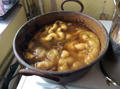
I have also experimented with: soaking bark in cold water before using as a dyestuff, no mordants, dying in a copper pot (i.e. using the pot as a mordant/modifier), alum mordant and iron mordant (colour modifier).


Above: Fibres in natural dye bath (copper pot).

The only preparation that I made on the pure wool and fleece was to soak in warm water for a few hours before adding to the dye bath to aid colour absorption. 

In addition to wool, I have been very successful at dying pure silk, and have had some success with cotton fabric. 

I have tried preparing the cotton by soaking in soda ash followed by soya milk. In some cases the results were good, in others not. I found that it was not necessary to pre-soak silk fabric. I have kept careful records of my experiments and the resulting samples in a notebook. In general colourfastness has been excellent with the exception of sloe berries (which were a lovely bright purple initially only to fade within a few days to brown).


Experiments with acid dyes and spinning

17 Sept 2015

I’ve been developing my dyeing techniques using acid dyes on wool (both hand spun and as fleece before spinning).

The examples above are fleece wool which I spun into a lumpy yarn, then dyed in a pot. The method involved first soaking the wool in vinegar solution overnight. The wool is then heated in the dye bath and when at a low simmer, dye powder is sprinkled into the dye bath. The dye pot is kept at simmering temperature for about 20 minutes, during which time it is not stirred. Some of the colours mix, but others stay as separate.

A check is then done to see if the dye bath has been exhausted (if so it will be clear). If not, more vinegar is added and the dye pot is heated for another 20 minutes. After the dyeing procedure, the bath is left to cool, then the wool is removed and rinsed in water. There should be no dye in the rinsing water (it should all have been absorbed and fixed into the yarn!) On most occasions this was true. Sometimes, however, I could not get an exhausted dye bath dispite adding more vinegar and had to conclude that too much dye powder had been used. The photo below shows an exhausted dye pot – the water around the dyed yarn is clear.

The example below shows some coil spinning which I subsequently dyed using a direct dye method (hand-painting).

After soaking in vinegar solution, I took the yarn, tied it is skeins then laid it on some clingfilm. I painted on a dye solution using a paintbrush. I let the colours blend, and tried to get rid of all the white (un-dyed areas). I then “fixed” the dye by heating in a microwave. The finished yarn is shown below:

I also used the same method to dye fleece before spinning see below centre and right (the left skein is naturally dyed).

Below is an example of some hand-painted yarn spun and Navajo piled after dyeing. I intentionally created a “marled” effect.

I hope to be able to use these yarns and fibres for spinning, weaving and making textured knitted and crocheted fabrics. They are a valuable addition to my visual vocabulary for the OCA textiles degree.


“The Print and Stitch Group”

December 2015

I have recently joined a newly formed textile and printing group which has been named “The Print and Stitch Group”. It was formed by invite only and is essentially a group of seven friends with a mutual interest in developing and sharing skills and exhibiting. We have held three meetings so far, and get together roughly every 6-8 weeks. 

There is an intention to exhibit in 2017 and we have chosen the theme of “identity” for our work. I am particularly delighted, as this was my suggestion! I have been collecting ideas and visual source material, and will be starting work on a themed sketchbook shortly.